In the realm of data visualization and analysis, the power of a well-constructed Power BI dashboard cannot be overstated. As a cornerstone tool for professionals seeking to translate complex datasets into actionable insights, mastering the intricacies of Power BI dashboards is essential. The distinction between a Power BI report and dashboard, while subtle, is significant in terms of how information is presented and acted upon. With the increasing reliance on data-driven decisions, the ability to craft the best Power BI dashboard that clearly communicates the right information to the right audience is more valuable than ever.
This article delves into the top ten tips for enhancing Power BI dashboard functionality and esthetic appeal. From creating an effective data model and mastering Data Analysis Expressions (DAX) functions to optimizing query performance and implementing dynamic titles and headers, each section is structured to guide you through improving your Power BI sample dashboard. Additionally, advanced strategies such as leveraging analytics, optimizing report performance, adding narrative insights, and ensuring data security through row-level security are explored. These insights provide a comprehensive roadmap for both novices and seasoned users aiming to elevate their data visualization prowess.
Create an Effective Data Model
Data Model Importance
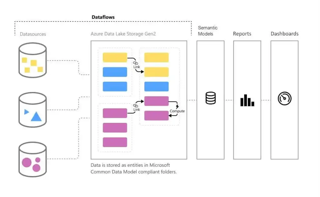
Data modeling in Power BI involves defining the data structure, properties, and relationships within a logical representation used to create reports and visualizations. This process supports efficient data exploration, allowing users to navigate through data hierarchies to discover insights and identify trends . Proper data modeling ensures the accuracy, consistency, and dependability of data, which enhances decision-making and report precision.
Data Model Best Practices
To create an effective data model, start by clearly defining the business analysis goals rather than just replicating data as it appears from the source. Employ a star schema for simplicity, where each entity is represented in a single table, optimizing the query and aggregation processes. Power BI’s data modeling capabilities are shared with Power Pivot and Analysis Services Tabular, making it essential to utilize tools like Power Query and the M language to handle granularities and multiple data sources effectively.
Data Model Performance Optimization
Optimizing a data model involves several key steps: normalizing data to its most granular form, establishing efficient table relationships, and using calculated columns and measures wisely. This reduces the need for complex DAX calculations and improves overall query performance . Additionally, employing compression techniques and being mindful of the model size are crucial for maintaining fast and responsive Power BI reports.
Master DAX Functions
DAX Basics
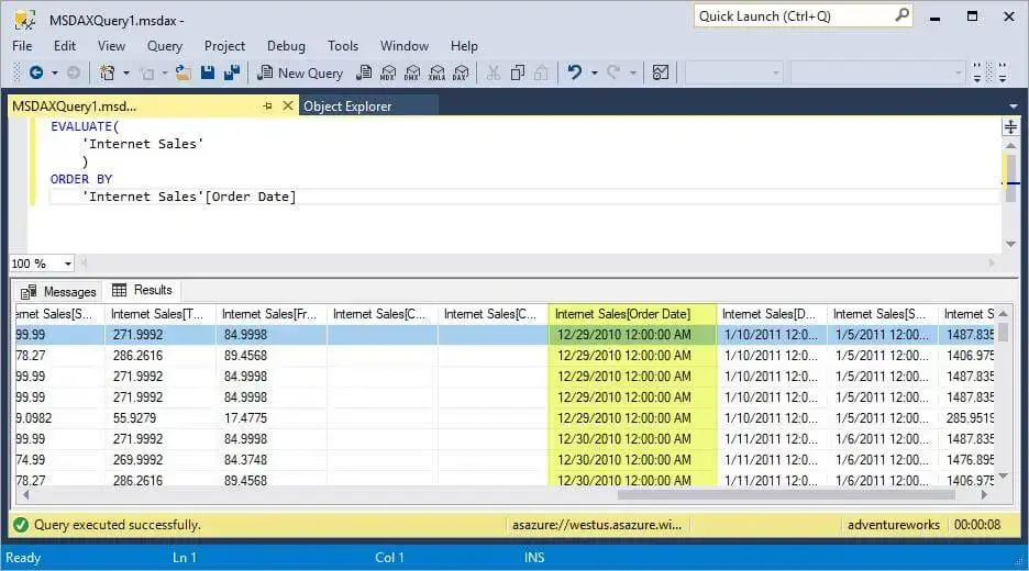
Data Analysis Expressions (DAX) are essential for performing calculations within Power BI. They consist of functions, operators, and constants that help in creating new insights from existing data models. Understanding the syntax, functions, and context of DAX is crucial for effective data manipulation and analysis. DAX syntax involves elements like measure names, equal-to operators, function calls, and parameter listings, which are structured to make DAX formulas both intuitive and powerful.
Advanced DAX Techniques
For those looking to elevate their DAX capabilities, mastering advanced techniques is key. This includes handling complex data models, utilizing time intelligence, and managing multiple tables. Learning to apply advanced filtering, optimization, and performance tuning can significantly enhance the functionality of Power BI dashboards. These skills are not only applicable in Power BI but also in other tools like Excel Power Pivot and Analysis Services Tabular models, making them versatile and broadly applicable.
DAX Performance Tips
Optimizing DAX functions involves several best practices. Using functions like CALCULATE and FILTER effectively can refine data analysis. For instance, CALCULATE allows adjustments in filter context, which is critical for accurate data aggregation. Similarly, the FILTER function can be used strategically to apply or preserve filter contexts over data, enhancing both the precision and speed of data retrieval. Employing variables in DAX formulas can reduce redundancy and improve calculation efficiency, thus speeding up the overall performance of Power BI reports.
Optimize Query Performance
Query Folding
Query folding is a powerful feature in Power BI that enhances query performance by allowing transformations to be executed directly at the data source, rather than in Power BI itself. This process is particularly efficient when dealing with large datasets, as it minimizes the data that needs to be transferred and processed within Power BI. For query folding to occur, certain conditions must be met, such as the data source being a database capable of receiving query requests and all steps in the query configuration supporting folding. If any step does not support folding, or if the query begins with custom SQL code, query folding will not occur.
DirectQuery Best Practices
DirectQuery allows for real-time data retrieval in Power BI, which is essential for maintaining up-to-date data visualizations. To optimize the performance of DirectQuery, it’s crucial to ensure that as much processing as possible is delegated to the data source. This can be achieved by identifying steps that prevent query folding and rearranging them when feasible. Additionally, using native SQL queries can enhance performance, though it’s important to note that certain functionalities, such as incremental refresh, may not be compatible with native SQL queries in DirectQuery mode.
Incremental Refresh
Incremental refresh is a feature in Power BI that improves the efficiency of data refresh operations by only refreshing the most recent data that has changed, rather than the entire dataset. This approach not only speeds up refresh times but also reduces the load on network resources and enhances the reliability of data refreshes. Incremental refresh is best suited for structured, relational data sources and requires the data source to support date filtering. Configuring incremental refresh involves creating specific Power Query parameters and applying them in the Power BI Desktop before publishing to the service .
By implementing these strategies, users can significantly optimize the performance of their Power BI queries, leading to faster and more efficient data analysis.
Design Visually Appealing Dashboards
Color Scheme Selection
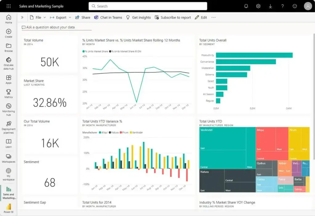
Selecting an appropriate color scheme is crucial in dashboard design to ensure both esthetic appeal and readability. Power BI allows users to apply dashboard themes, which can include predefined or custom color schemes. The default theme is typically Light, but users have the option to customize this by selecting the Custom option in the dropdown menu and creating their own color themes using JSON files . This flexibility supports the incorporation of corporate colors or other thematic elements that align with organizational branding or seasonal themes.
Layout Optimization
The layout of a dashboard significantly influences user engagement and data comprehension. Organizing visuals logically and intuitively enhances the dashboard’s usability, making it easier for users to navigate and extract needed information quickly. Key practices include grouping related metrics together and ensuring a consistent layout that guides the user’s eye through the data naturally . Proper positioning and sizing of visuals according to their importance and detail level also play a critical role in optimizing the dashboard layout.
Custom Visualizations
Utilizing custom visualizations can elevate a dashboard’s effectiveness by tailoring data presentation to the specific needs of the audience. Power BI supports a wide range of custom visuals, from Gantt charts for project management to more complex visuals like Radar Polar charts for multivariate analysis . These customizations allow users to present data in a more engaging and understandable way, catering to specific analytical requirements and enhancing the overall impact of the dashboard.
Leverage Advanced Analytics
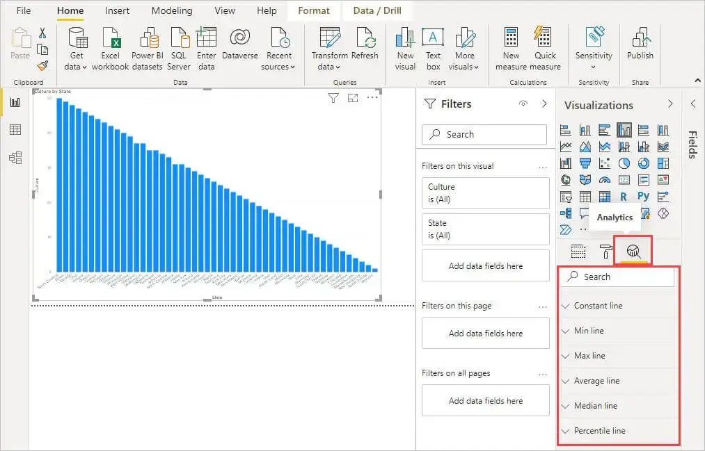
Forecasting
Power BI enhances forecasting capabilities by employing various statistical models to predict future trends based on historical data. Users can leverage exponential smoothing, which prioritizes recent data, assuming it’s more relevant for future projections . Additionally, ARIMA-like models cater to data with trends and seasonality, allowing for more accurate forecasts . Power BI’s integration with advanced tools like Azure Machine Learning and the use of Python and R scripts further sophisticate forecasting, enabling the application of machine learning models directly within reports.
Clustering
Clustering in Power BI allows users to group data based on similarities, providing a fresh perspective on data analysis. This feature is accessible through visuals like Scatter Plots and Table visuals, where users can automatically find clusters or manually adjust the number of clusters as needed . However, it’s important to note the limitations, such as clusters not updating with data refreshes, which may require manual re-clustering over time.
Anomaly Detection
Anomaly detection in Power BI is designed to identify unusual patterns that deviate from expected behavior in time series data. This feature not only detects anomalies but also provides explanations, helping users understand potential causes of such deviations . Anomaly detection is integrated within line chart visuals and requires a minimum of four data points to function effectively . This tool enhances data monitoring by automatically highlighting and explaining anomalies, thereby supporting more informed decision-making.
Implement Dynamic Titles and Headers
Dynamic Title Techniques
Dynamic titles in Power BI dashboards enhance user interaction by adjusting based on data selections or user actions. By utilizing Data Analysis Expressions (DAX), titles can reflect changes in the data context, such as filter applications or specific user interactions. For instance, a title might display the name of a product brand based on the user’s selection in a slicer. This approach not only makes reports more interactive but also helps in maintaining relevance to the user’s current analysis focus. Users can implement these dynamic titles by creating DAX expressions that react to changes in the data model, such as using the USERCULTURE() function to adjust titles based on the user’s locale .
Header Customization
Customizing headers in Power BI reports allows for a more tailored and polished presentation. Users can add various elements like text boxes, images, and borders directly from the Home tab under the ‘Text Box’ option, enabling them to craft descriptive and visually appealing headers. These elements can be formatted for alignment, font style, and color to match the report’s theme. Additionally, incorporating images into headers can be done through the ‘Insert’ tab, where users can select and position images as needed, enhancing the esthetic appeal of the dashboard.
Contextual Information Display
Headers and titles in Power BI can be designed to provide contextual information, making the data analysis process more intuitive and insightful. By adding dynamic elements that reflect the current data selection or analysis, such as data-bound images or variable text in headers, users gain a clearer understanding of the presented data. This functionality not only improves user engagement but also aids in the coherent presentation of data, ensuring that all visual components on the dashboard are aligned with the user’s current analytical focus.
Utilize Bookmarks and Buttons

Creating Interactive Bookmarks
Bookmarks in Power BI serve as a powerful tool for saving the state of a report page, including filters and visual configurations . Users can create a collection of bookmarks to sequence through different views, effectively narrating a data-driven story . Modifications to bookmarks, such as adding new visuals or adjusting existing settings, are managed through the “Update” option, ensuring that each bookmark reflects the latest report state . Additionally, bookmarks can be renamed for clarity and organization.
Custom Navigation Buttons
The functionality of bookmarks is greatly enhanced by the strategic use of buttons in Power BI reports. Buttons can be designed with various states—normal, hover, and pressed—to create a dynamic user experience . These buttons can link to specific bookmarks, facilitating seamless navigation within the report . For example, a button can be set to navigate to a different view on the same page, allowing for a compact and efficient presentation of information . This setup is crucial for reports that contain multiple visuals related to the same topic but need to avoid clutter.
Story-telling with Bookmarks
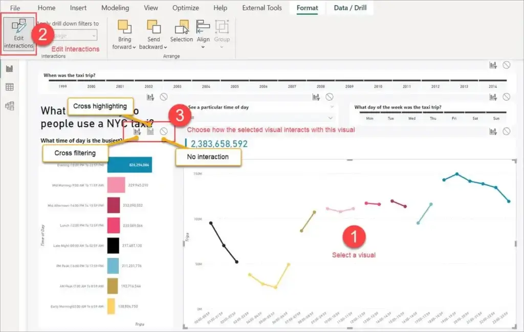
Bookmarks can be more than just navigational aids; they can be used to tell a story. By arranging bookmarks in a specific order, users can present a narrative, highlighting key insights sequentially . This is similar to conducting a slideshow where each bookmark acts as a slide . Power BI provides options like “View” mode in the bookmarks pane, which simplifies the presentation process and enhances the interactivity during presentations, allowing for real-time data exploration and cross-highlighting.
Optimize Report Performance
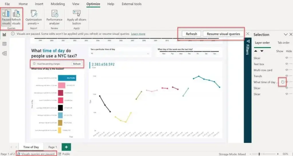
Performance Analyzer Usage
Power BI’s Performance Analyzer is a robust tool that enhances report efficiency by enabling users to inspect and log the performance of report elements such as visuals and DAX formulas. When users interact with a report, the Performance Analyzer records the time taken to update visuals and the resources used during this process . This tool is particularly useful for pinpointing which visuals are slowing down report performance and identifying the underlying reasons. Users can activate the Performance Analyzer from the View ribbon in Power BI Desktop, allowing them to monitor the performance of DAX queries and visual rendering in real-time.
Reducing Visual Complexity
To optimize report performance, it is crucial to manage the complexity of visuals. Reducing the number of visuals per report page can significantly enhance performance; for instance, limiting widget visuals to eight and grids to one per page is recommended. Additionally, replacing complex visuals with simpler ones or reducing the data points in a visual can decrease load times and improve responsiveness. This approach not only streamlines the user experience but also reduces the computational demand on Power BI.
Data Reduction Techniques
Effective data management is key to optimizing report performance. Techniques such as filtering, aggregating, and summarizing data help focus on relevant information, thereby speeding up report loading and refreshing times. Implementing data reduction strategies like partitioning and indexing can also improve the efficiency of data queries and reduce overall memory usage. For large datasets, using DirectQuery to pull data directly from the source can be beneficial, as it minimizes the amount of data loaded into Power BI, thus enhancing performance. Additionally, careful data modeling and compression are essential to maintain a lean and efficient data environment.
Add Narrative Insights

Natural Language Generation
Power BI’s Q&A feature allows users to interact with their data using natural language queries, providing an engaging and intuitive way to explore and analyze data. This feature leverages an in-memory storage to deliver fast and interactive experiences, where users can ask questions, receive visualized answers, and follow interesting data paths . The natural language capabilities are further enhanced by contextual suggestions and immediate feedback, similar to search engine interactions, helping users refine their queries for more precise results .
Key Insight Highlighting
The smart narrative visualization in Power BI offers a quick and customizable way to generate textual summaries of data insights directly within reports. These narratives can highlight key takeaways, trends, and can be tailored to address specific audience needs. Users can edit the language, format, and even the content of these narratives to better suit their reporting goals. This feature dynamically updates with data refreshes, ensuring that the narrative always reflects the most current data .
Custom Narrative Visuals
For users with edit permissions, Power BI’s Copilot offers the capability to generate narrative visuals directly on the report page. These narratives can be customized using prompts that guide the Copilot to focus on specific aspects of the data, such as tourism metrics or customer retention factors. Users can modify existing narratives to adjust tone, summarize content, or emphasize key points, making the insights highly relevant and tailored to specific analytical needs .
Implement Row-Level Security
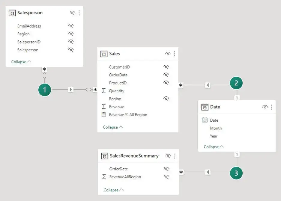
RLS Setup
Setting up Row-Level Security (RLS) in Power BI involves defining roles and filters that control data access. Users can start by importing data into Power BI Desktop or configuring a DirectQuery connection. From the Modeling tab, select Manage Roles and then New to create a role. Specify a role name and select the table to apply a security filter. Filters can be defined using the default editor or by switching to a DAX editor for more complex expressions.
Dynamic Row-Level Security
Dynamic RLS adjusts access based on the user’s login information rather than fixed user details. This method utilizes DAX functions like USERPRINCIPALNAME() or USERNAME() to match data access permissions with the logged-in user’s credentials. In Power BI, setting up dynamic RLS involves creating a role under the Modeling tab, where users can specify DAX criteria directly related to user login details. This approach ensures that users see only the data relevant to their roles, enhancing data security and relevance.
Testing and Validation
Once RLS is configured, testing its functionality is crucial to ensure it operates as expected. In Power BI Service, users can test RLS by selecting the dataset and navigating to the Security option. Here, the Test as role feature allows users to simulate how the data appears for different roles. It’s essential to verify that the RLS settings apply correctly across various user scenarios to maintain data integrity and security.
Conclusion
Throughout this comprehensive exploration of Power BI, we’ve traversed the landscape of data visualization and analysis, spotlighting the significance of crafting well-orchestrated dashboards. By delving into strategies that span from creating an effective data model and mastering DAX functions to implementing dynamic titles and leveraging advanced analytics, the article serves as a foundational roadmap for enhancing the clarity, efficiency, and impact of your Power BI reports. The journey through optimizing query performance, designing visually appealing dashboards, and enabling insightful narrative insights further underscores the power of Power BI in transforming complex datasets into actionable intelligence.
As we conclude, it’s imperative to reflect not only on the tactical aspects that elevate a Power BI dashboard but also on the strategic implications of our findings. The discussed methodologies not only streamline the data visualization process but also amplify the decision-making prowess by offering nuanced insights and fostering an engaging analytical environment. By adopting these practices, users are well-positioned to push the boundaries of conventional reporting, encouraging further exploration and innovation in the domain of data analytics. This exploration underscores the dynamic nature of Power BI as a tool and serves as a clarion call for continued learning and adaptation in the ever-evolving field of data analysis.


